So you’ve just hit the Paint.NET “New…,” “Canvas Size” or “Resize” option. And suddenly, to your horror, you see…THIS!
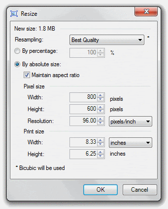
…or something like it. (This, specifically, is the “Resize” option from the “Image” menu.) Holy cowbirds*! An array of options! How do you deal with this? What is “Resolution?” What is going on here? Maybe you’ve just stuck with the “By Percentage” option, to be safe. I’m going to teach you to expand beyond the basic “Shrink by 50%” reflex and show you how to maximize your printing power with Paint.NET’s DPI tools.
‘s fantastic “Printer+” plugin (in this plugin pack) and @I Like Pi‘s incredible “OptiPNG” plugin (available here) to maximize the quality of your print and web images. I’m not going to use them in this tutorial, though.]
Also, you’ll find footnotes denoted by linked asterisks (*) and carets (^), including multiples and combinations thereof. Click on them, and they’ll link to the footnote at the bottom of the post.
So! Now that we’ve got that out of the way,
Here’s what we’re planning to look at today.
1. What is this “DPI” thing anyway?
To understand DPI (“Dots Per Inch”), you need to understand the basics of raster imaging. Paint.NET is a raster image editor. This means that it uses pixels (small blocks of colors) to build up an image.
What are pixels? Try opening a photo and zooming in really, really closely. For instance, take this picture** (Go ahead! Take it! It’s public domain!):

and zoom in really close on the red square around her eye (this is 1000% zoom):

That, my friend, is the DNA of this image. The building blocks. The LEGOs, if you like that sort of thing (and who doesn’t?!). The blocky pixels are shown on a computer screen in rows and columns so small that the naked eye doesn’t see the individual pieces (though if you get close enough to a projector screen, you’ll probably be able to identify the individual pixels fairly easily). Instead, the tiny little blocks of color flow together to create the beautiful lines and curves of a photograph or drawing.
How does DPI fit into all of this? Well, here’s the secret of DPI: it’s really a huge scam.
Oh, sure, it does affect the printing, and sometimes the display, of the image. But it doesn’t actually change the image itself at all.
No kidding. It’s just a number that Paint.NET (or Photoshop, or Paint, or Corel Draw…) saves alongside the image so that the computer knows what size you mean for the image to be.
So, take a look at this image***:

Now, that image, which is 100 pixels wide, was shown at 96 DPI (Dots Per Inch), meaning that its 100 pixels should be filling slightly more than one inch on most monitors^. But, if we were to change the DPI – say, to 50 or so – it would expand those 100 pixels to fill 2 inches of space (100 / 50 = 2, get it?):

Notice that the image got choppier. The individual pixels are much more visible now, and the image doesn’t look as good. We’ll talk about ways to fix that in section 4.
Or change the DPI to 200. Now it will shrink those pixels to fill a half inch of space (100 / 200 = .5):

Holy Glossiness, Batman! The image got a lot higher-quality! That’s because, since the individual pixels are so much smaller, they’re less visible. that means that the overall curves and lines are more prominent.
(Ok, you caught me. The image is still at 96 DPI, and I just resized it to make it look like it was at 50 DPI and 200 DPI. That’s because most programs (including your browser, most likely) render images based solely on their pixel size, not their resolution. But if they did, that’s how they would look.)
But you get the concept, right? To review:
-Paint.NET is a raster image program.
-Raster means it uses pixels.
-Pixels are the tiny little blocks that make up an image.
-DPI doesn’t change the image, it just changes how it’s displayed.
-When DPI is higher, the image is smaller because the pixels fill a smaller space.
-When DPI is lower, the image is larger because the pixels fill a larger space.
-The higher the DPI, the better the image quality. (And vice versa)
We clear? Feel free to comment with any questions you have, and come back to the rest later if you need to digest.
2. How can I optimize my image for print?
So this is the nuts and bolts. This is what DPI really boils down to.
See, your printer will print out the image at the size dictated by the image’s DPI. Remember how the image above got smaller with a larger DPI? Same thing applies to printers. Now, while typical monitor resolution is 96 DPI, a printer typically runs anywhere from 150 to 600 DPI. If you have a typical InkJet printer, it’s probably capable of 300-600 DPI, but if you are taking it to a professional printing house (like Kinko’s FedEx Office), they probably have a color LaserJet printer capable of resolution well up into the 1000 DPI range (some even as high as 1800 DPI). The human eye is usally satisfied with something at 300-600 DPI, so it’s a good baseline for most work.
No problem, right? We’ll just change the DPI to 300 or so. No worries.
Except that if you do that, it will make this image^^…

…about this big on the page:

Humph. Well, that sucks. Moral of the story? Work bigger. Much bigger. As big as possible, and don’t shrink it down until you’re absolutely, positively, without-a-doubt DONE. And always, always, ALWAYS save the full-size .PDN with layers, because you never know when you’ll need to change something later. Because if you print it out at 96 DPI, it’ll look like this:

Yuck. That’s because a dot of ink is much smaller than a pixel, meaning more fit in an inch. Resizing it up will just make it look nasty.
We’ll talk more about how to fix that (kinda) in section 4, but for now, let’s review.
-DPI tells the printer what size to print the image at.
-Your InkJet printer can probably print at 300-600 DPI. That’s good enough for most work.
-Work as big as possible.
-Work as big as possible.
-Work as big as possible!
-Don’t resize down until you’re ready to print, and ALWAYS keep the full-size, layered .PDN file.
Take a breather before going on to…
3. How can I optimize my image for the Web?
This section is going to be much smaller, because the fact is, resolution doesn’t do much for web-based images. They’ll most always display at 96 DPI, no matter how you save it. (See the footnote for the first section where I admit publicly that I lied stretched the truth a bit).
For proof, look at these images*^*. The first is saved at 96 DPI, the second at 300 DPI, the third at 14,400 DPI:


While they all look the same on your screen, they would look vastly different on paper. The first one would be slightly more than an inch and a half in size, the second one would be around half an inch, and the third one (if I’ve done the math right) would only be about the size of one pixel at 96 DPI.
So, how can I optimize my image for the Web? Well, some of the principles we’ve learned above will apply here. First of all, remember that a larger DPI (more pixels in a smaller space) means higher quality. So, similar to the Print section, work with the image in a large size before sizing it down for web. Adjusting the actual DPI does nothing, but you can fake this with image size: For instance, if you are making a signature for the forum, work with it at 1000×300, and right when you get done, shrink it down to 500×150.
This is half of my current sig, at the size it was when I was working on it^^^:

And, after resizing down:

Notice that it got a lot less jaggedy. The lines became smoother, the image looks better…overall, it’s a much nicer image. This is the dirtiest secret in image editing: Work big, then shrink down. It’s the easiest way to cover mistakes at the pixel level, because the eye just can’t see them anymore.
[NEW] Another thing to keep in mind – you’ll probably want to work at 200%, 400%, 800%… (keep doubling) because pixels look best when cut in half, rather than in thirds or fifths. 200% or 400% should most often be big enough. For instance, sigs on this forum will eventually be 500×150, so working at 1000×300 is the simplest way to resize. It looks the best when it goes down exactly 50%. So, when you start off a project, increase canvas size by 200% or 400%, and when you’re done, resize down to 50% or 25% to get your desired size. The computer works best that way.
And ALWAYS keep the full-size, layered .PDN in case you need it later.
Quick review:
-DPI doesn’t do anything for web graphics.
-Work with a high image size, then shrink it down to save it.
-ALWAYS keep the full-size, layered .PDN on hand in case you need it later. (How many times can I say it?)
We’re in the home stretch now!
4. How can I make an image higher-resolution? (Or: CSI has LIED to you!)
Short answer: You can’t.
Long answer: Yyyooouuu cccaaannn”’ttt…
Have you ever seen this scenario played out on TV? The CSI shows do it as often as
. Even
(and literally everything that comes out of his mouth is gibberish in that clip), though I’m willing to forgive him since it was the 80’s and NO one knew what they were talking about. (But this is probably the funniest parody of Hollywood’s computer illiteracy.)
Anyway, they’re lying to you. There’s no computer system in the world that can do what the computers in CSI are depicted as doing. While an image can easily be resized smaller, it can never satisfactorily be made larger. Why is that?
Because the image is made up of pixels, remember? At its core, this image*^^…

…is just this:

A bunch of pixels.
So what do you get when you blow up a grainy surveillance photo^**?

You get a close-up of a grainy surveillance photo.

Asking the computer to “enhance” it, like on CSI, is like giving someone a book with three out of every four pages missing and asking them to reconstruct the story. It can’t be done very accurately, because the information isn’t there, and there will never be any technology that will let us do that.**^
So, what can you do if you need the picture to be bigger?
Well, the easiest way is to just take a bigger picture. You’ll never make an enlargement look as good a picture that was taken at the size you want.
But there are tricks you can employ. First, leave the drop-down menu in Paint.NET on “Best Quality.” It’ll automatically choose the best way of “guessing” at the missing information. Second, try running Gaussian Blur, followed by Sharpen. Repeat several times, and you’ll get something passable. Keep in mind, though, this really only works at images that have been doubled in size at best. More than 200%, and you’re getting into impossible territory.
And if you come up with a technique that works better, share it below! I am open to suggestions, most definitely.
But, to review…
-You can’t “enlarge and enhance” like they do on TV.
-The writers of CSI are dirty rotten liars. (Well, they don’t know computer graphics as well as they claim to. Same thing.)
-The best way to have a bigger picture is to take a bigger picture.
And there you have it!
You’ve learned all there is to know^^* about resolution and DPI in images. Congratulations!
I know there’s really not much of an outcome here, but feel free to ask questions, comment, and show the Before and After images you’ve resized.
Bon voyage!
Footnotes:
* My roommate says this. No, I don’t know why.
** This image is “Girl with a Pearl Earring,” by Johannes Vermeer. Image found here.
*** This image is a detail from “Rayons du Soir (Sails at Sunset),” by Charles Cottet. Image found here.
^ Well, almost. If your monitor isn’t displaying at native resolution, it won’t. If your monitor isn’t a 96 PPI monitor, it won’t. But for most monitors and most people, 96 pixels equals 1 inch. Also, technically, this is PPI (Pixels Per Inch), not DPI (Dots Per Inch), because it’s shown on a screen, not printed on a page. But I’m using the same term all over for simplicity’s sake.
^^ This image is “The Singing Butler,” by Jack Vettriano. Educational use: Image not public domain.
*^* This image is a detail from “Lydia Leaning on Her Arms in a Theatre Box,” by Mary Cassatt. Image found here.
^^^ Parts of this image from still shots of the Destiny, from Stargate Universe. Educational use: Image not public domain.
*^^ This image is a detail from “L’Estaque,” by Paul Cézanne. Image found here.
^** Image modified from “Surveillance, by William Betts. Educational use: Image not public domain.
**^ At least, not with our current understanding of technology.
^^* Not even close.
Paint.net setup can download from the button below. #
Credits: paint.net


